
The Followell site did not begin as a blank canvas. It arrived as a collection of strategic writing, generated site concepts, screenshots, original vector artwork, hero experiments, font files, and several implementations that disagreed with one another.
The job was not to choose a folder and call it the website. It was to determine what each artifact knew, establish which decisions were authoritative, and rebuild the result in a system small enough to understand completely.
Treat references as evidence
Generated code is good at preserving visible intent. It can show how a section should feel, how an illustration occupies the viewport, which spacing relationships matter, and what a transition was trying to communicate.
It is not automatically authoritative about dependencies, component boundaries, build tooling, or the final content model.
We classified the supplied material by role: strategy, approved copy, visual composition, original production asset, behavioral reference, or superseded experiment. When two sources conflicted, the explicit business decision won, followed by approved content, visual direction, original assets, and only then generated implementation detail.
That hierarchy turned a pile of creative history into a usable source of truth without flattening or discarding the history itself.
Rebuild the decisions, not the framework
The final site uses plain HTML, Sass, Markdown, and a small Node build script. There is no client framework and no general-purpose static-site generator.
The builder handles the specific things this site needs:
- front matter and Markdown content collections;
- page templates and nested partials;
- work and field-note indexes;
- sibling navigation;
- Sass compilation and static asset copying;
- development watching and live reload;
- deterministic production output in
dist.
That is intentionally the complete list. The system does not need a plugin ecosystem to publish a case study. It needs a clear content shape and a build that fails loudly when a partial is missing or circular.
Make the visual language structural
Followell's identity uses a compact set of recognizable moves: navy and cream fields, restrained orange and rust signals, tight uppercase display type, small monospaced system labels, editorial rules, and stripes that behave more like routed paths than decoration.
Those ideas are expressed as reusable layout and styling primitives rather than copied section-specific values. The home page remains art-directed, while collection pages share the same typography, spacing, navigation, content widths, and responsive rules.
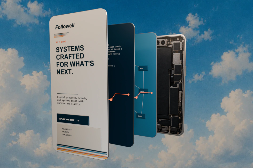
The exploded phone hero was handled the same way. The original artwork remains an image asset; the mask, cropping, annotations, responsive framing, and surrounding stripe geometry are native page structure. That keeps the composition adjustable without pretending the artwork itself should be recreated in CSS.
Content is part of the system
The first version of the content layer proved that pages could render, but it contained fictional companies and generic essays. That is acceptable scaffolding and unacceptable published work.
The finished publishing model supports honest case studies, substantial field notes, lead artwork, embedded Markdown images, captioned figures, wide diagrams, and responsive image pairs. Content assets live beside clear collection namespaces rather than in an undifferentiated upload directory.
The result
The result is not a conversion of any one concept. It is a synthesis: visually specific, operationally ordinary, and small enough that a future change does not require rediscovering how the site works.
That is the standard we want for client systems too. Preserve the knowledge. Remove accidental complexity. Build the thing the current problem actually calls for.